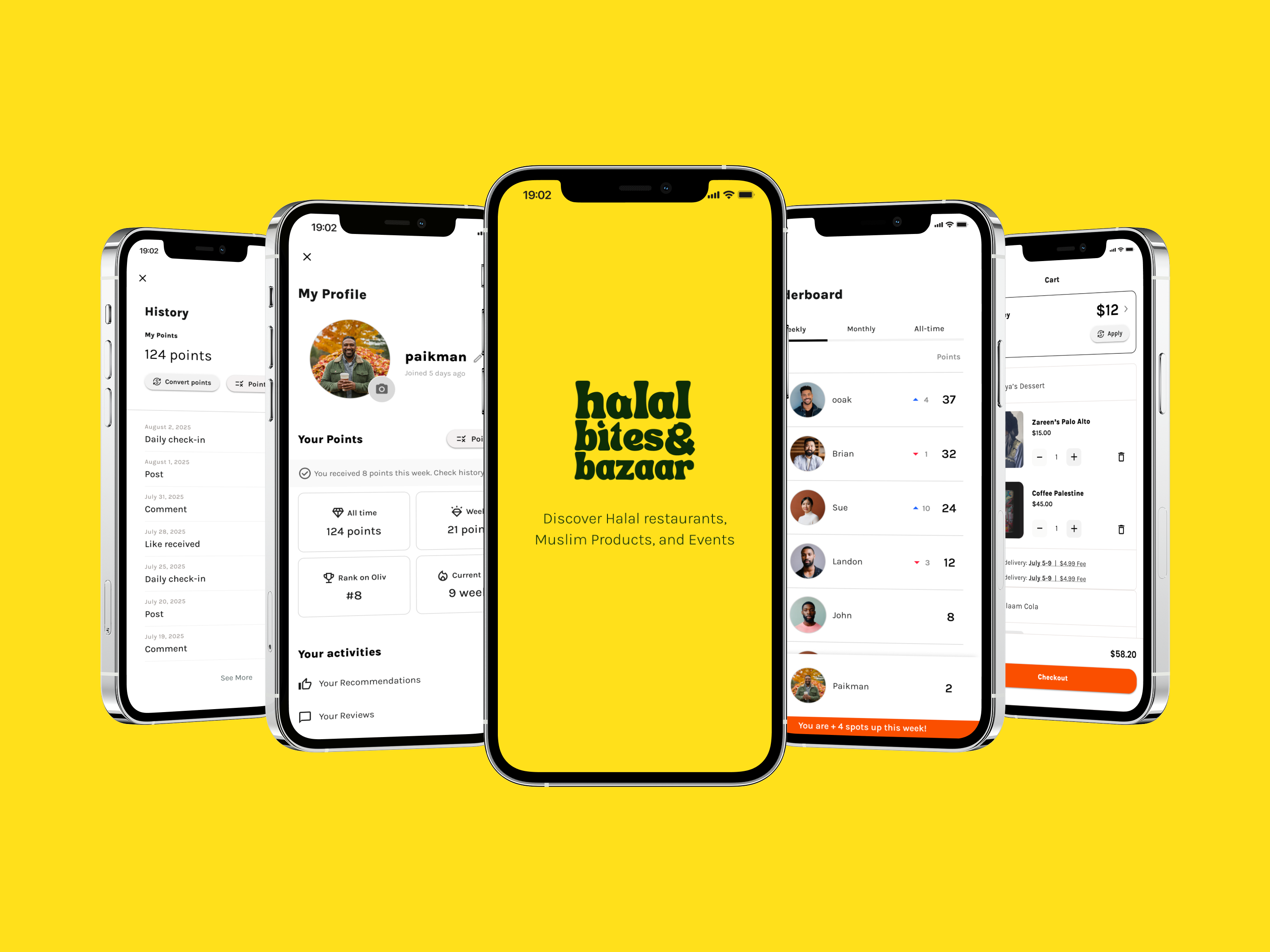
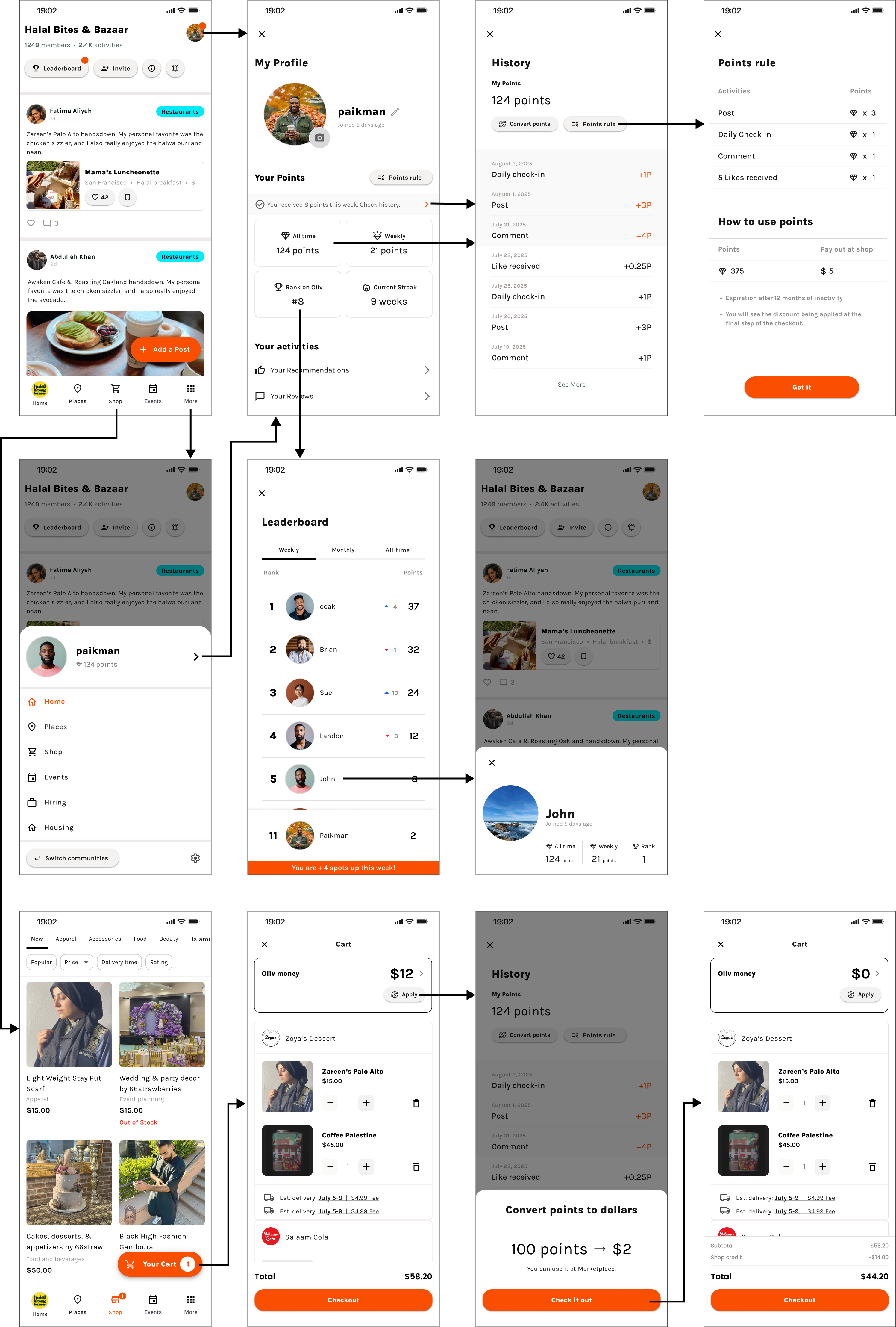
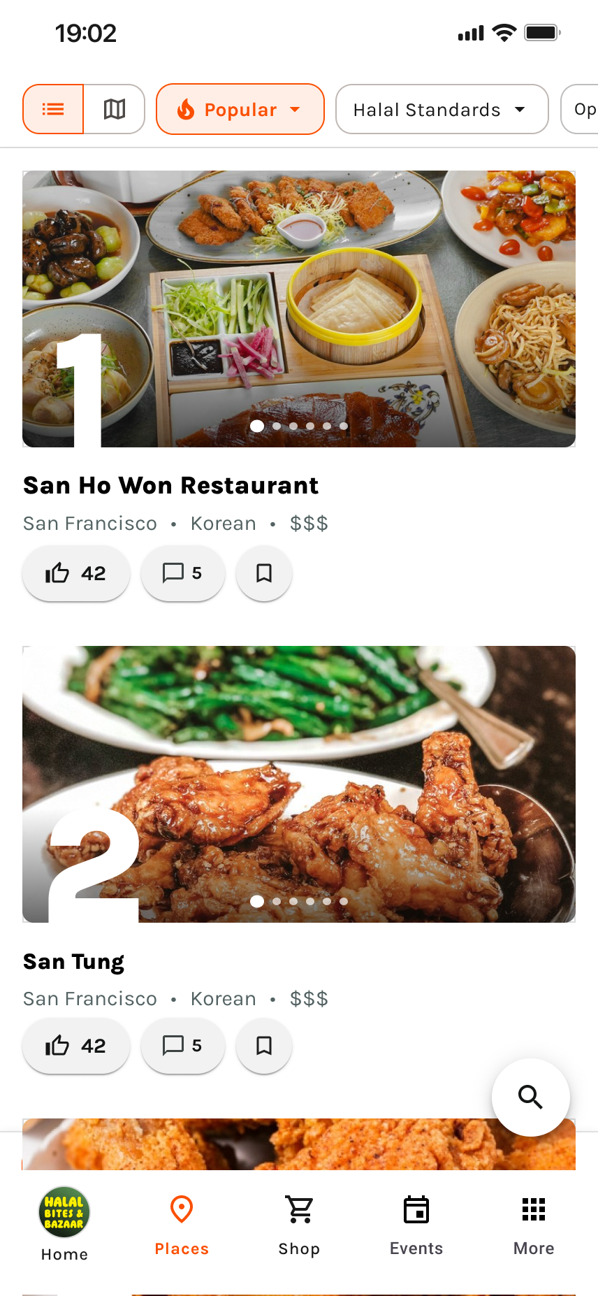
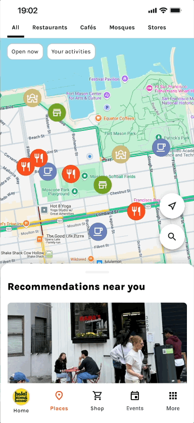
As a single designer, I redesigned
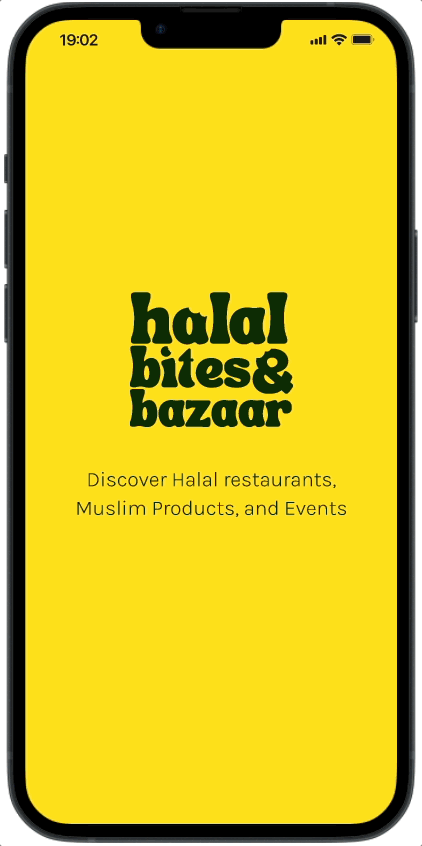
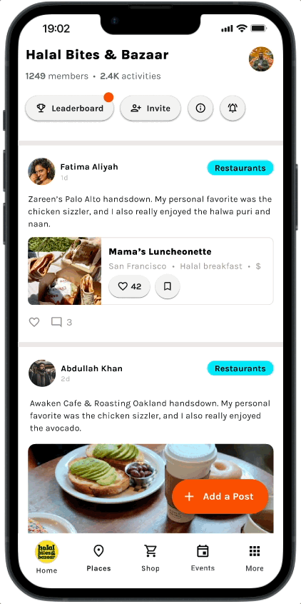
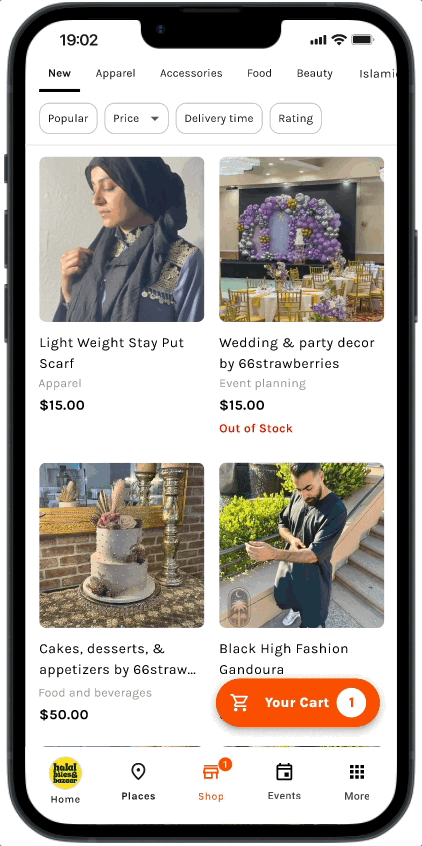
OLIV mobile app refresh and new features to boost engagement including:
The goal was to design fresh, community-related local content in a more dynamic and refreshing format, to help users easily find what they're looking for in one place.
I closely collaborated with 2 CEOs who are a design director and a founding engineer. Currently the company is implementing my designs.