Built desktop screens for web platform.
Screen Size
Space
Layout Columns
To ensure consistency, the screen is responsive to screen height, with a fixed width of 1440px.
Custom breakpoint in Tailwinds: 1440px
To help position elements in the interface, columns are proposed to serve as a guide in this step.
Standard spacing: 24px
Spacing scale: 8px
To help position elements in the interface, the design uses a 5 column layout.
Margins: 24px
Gutters: 56px
Column grid: 5
Used Tailwind CSS color tokens to ensure consistency between design and development, and to optimize collaboration with engineers.
Blue

Blue 800
#1E40AF

Blue 600
#2563EB

Blue 500
#3B82F6

Blue 100
#DBEAFE

Blue 50
#EFF6FF
Black/White

Zinc 900
#18181B

Blue 600
#2563EB

Blue 500
#3B82F6

Blue 100
#DBEAFE

Blue 50
#EFF6FF

Blue 50
#EFF6FF
Blue 50
#EFF6FF

Blue 50
#EFF6FF
Tertiary

Zinc 900
#18181B

Blue 500
#3B82F6

Blue 50
#EFF6FF

Blue 50
#EFF6FF

Blue 600
#2563EB

Blue 100
#DBEAFE

Blue 50
#EFF6FF

Blue 50
#EFF6FF

Zinc 900
#18181B

Blue 500
#3B82F6
Text alignment is primarily applied Left Align.
Used System Icons. 16px, 24px, 40px
Headline Large - Inter Semibold 20px
Headline Medium - Inter Medium 16px
Title Large - Inter Semibold 14px
Title Medium - Inter Medium 14px
Title Small Text 2 - Inter Medium 12px
Body Large - Inter Regular 14px
Body Medium - Inter Regular 12px
Body Small - Inter Light 12px
Label Large - Inter Regular 12px
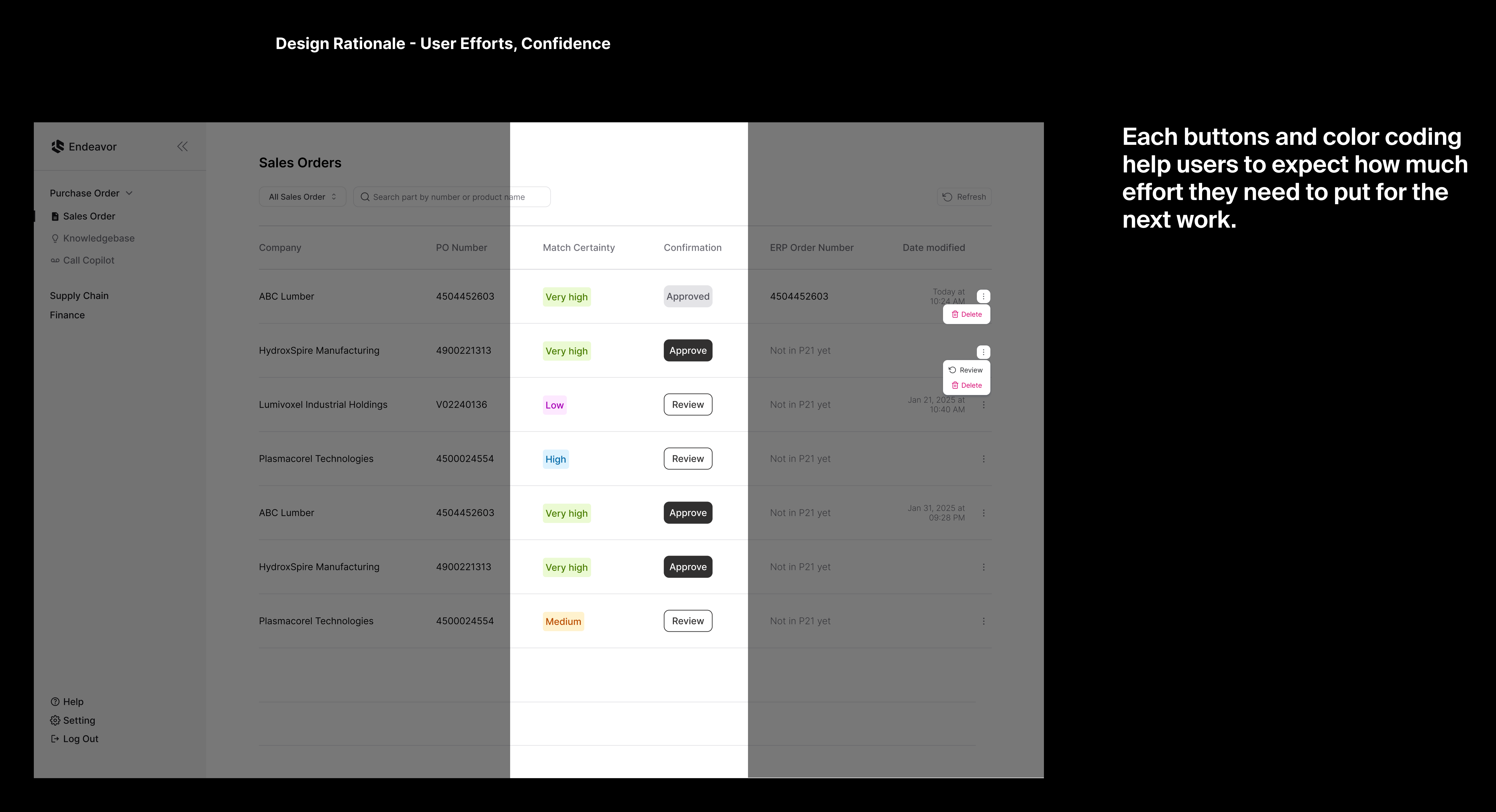
Used to convey dynamic information, such as a count or status. A badge can include text, labels, or numbers.

Used for single-step actions and as Calls to Action (CTAs), while using icons to quickly convey actions at a glance.
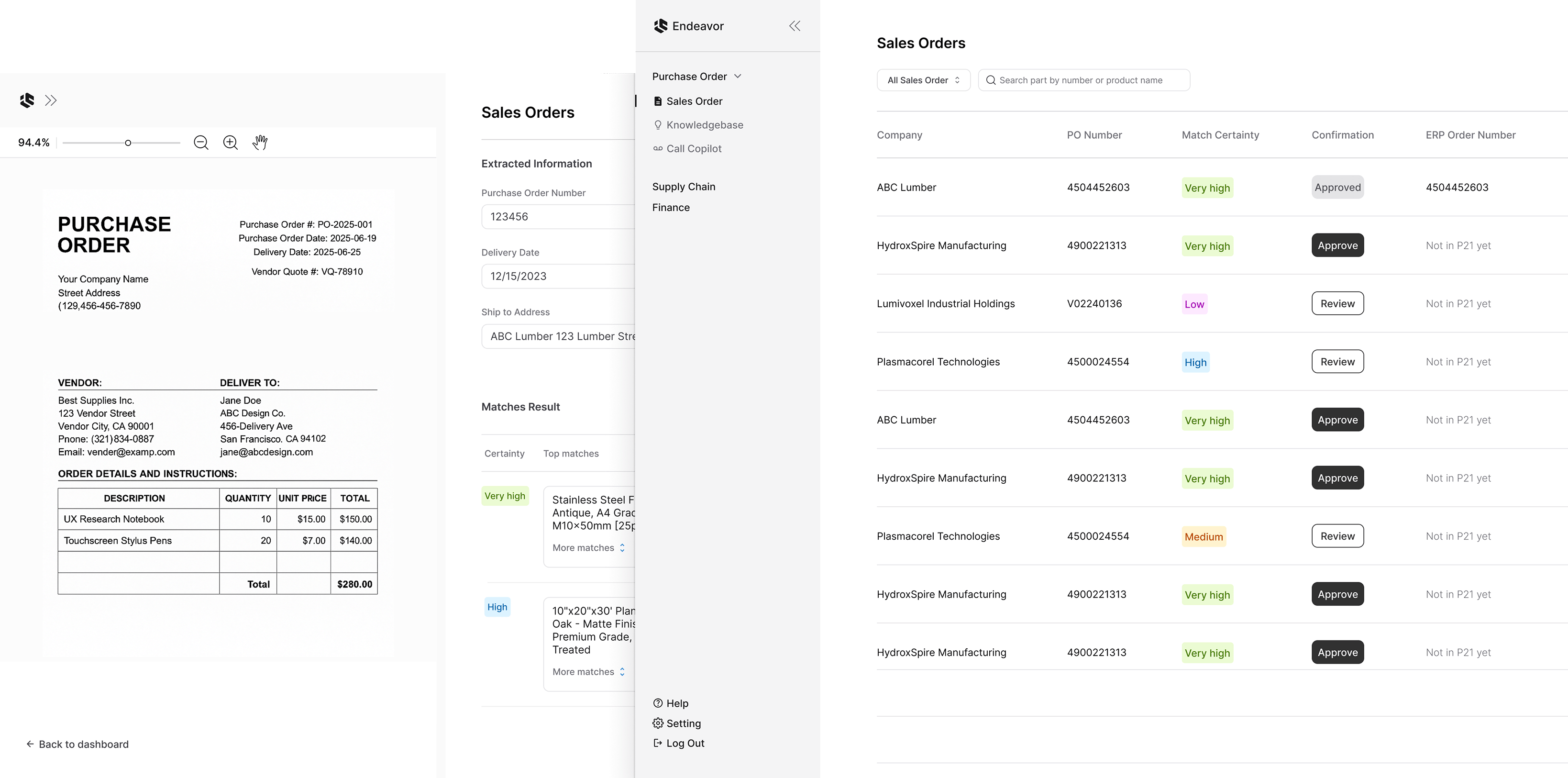
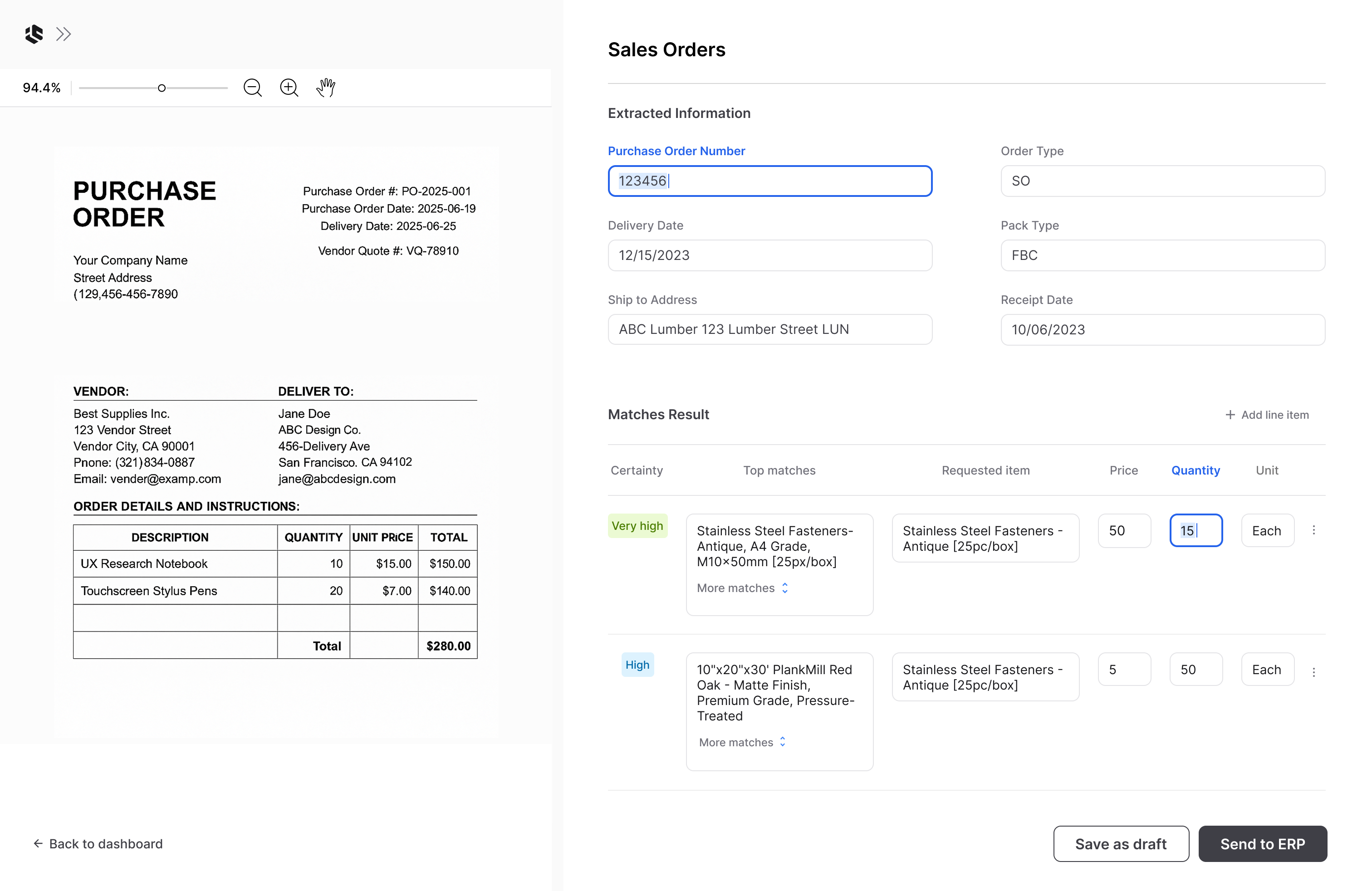
Typically used when users have multiple items to choose from. These are used in components like Sales Order Filter, See More Match Items, and Shipment Type, where an action is triggered based on the user’s selection.

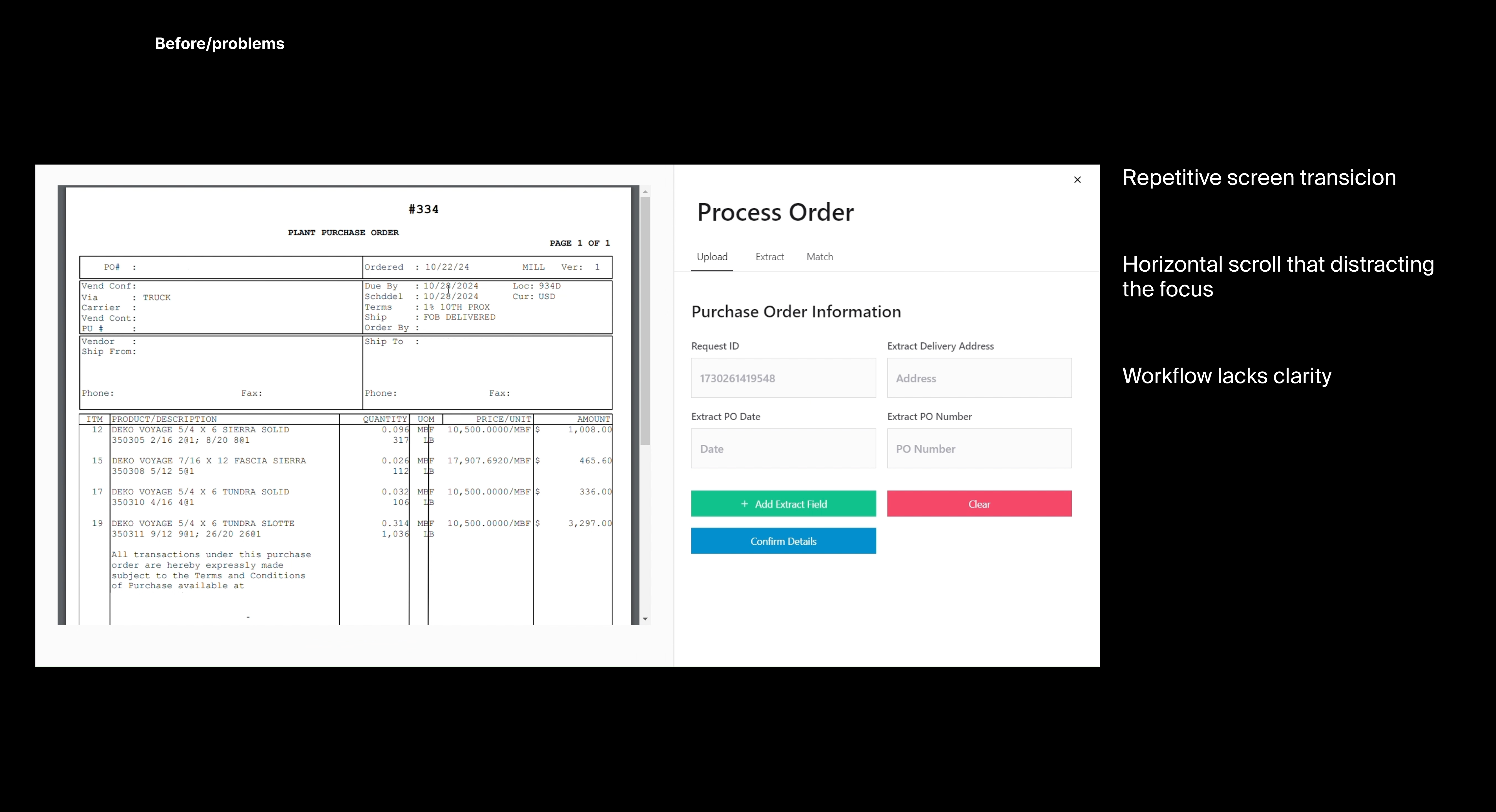
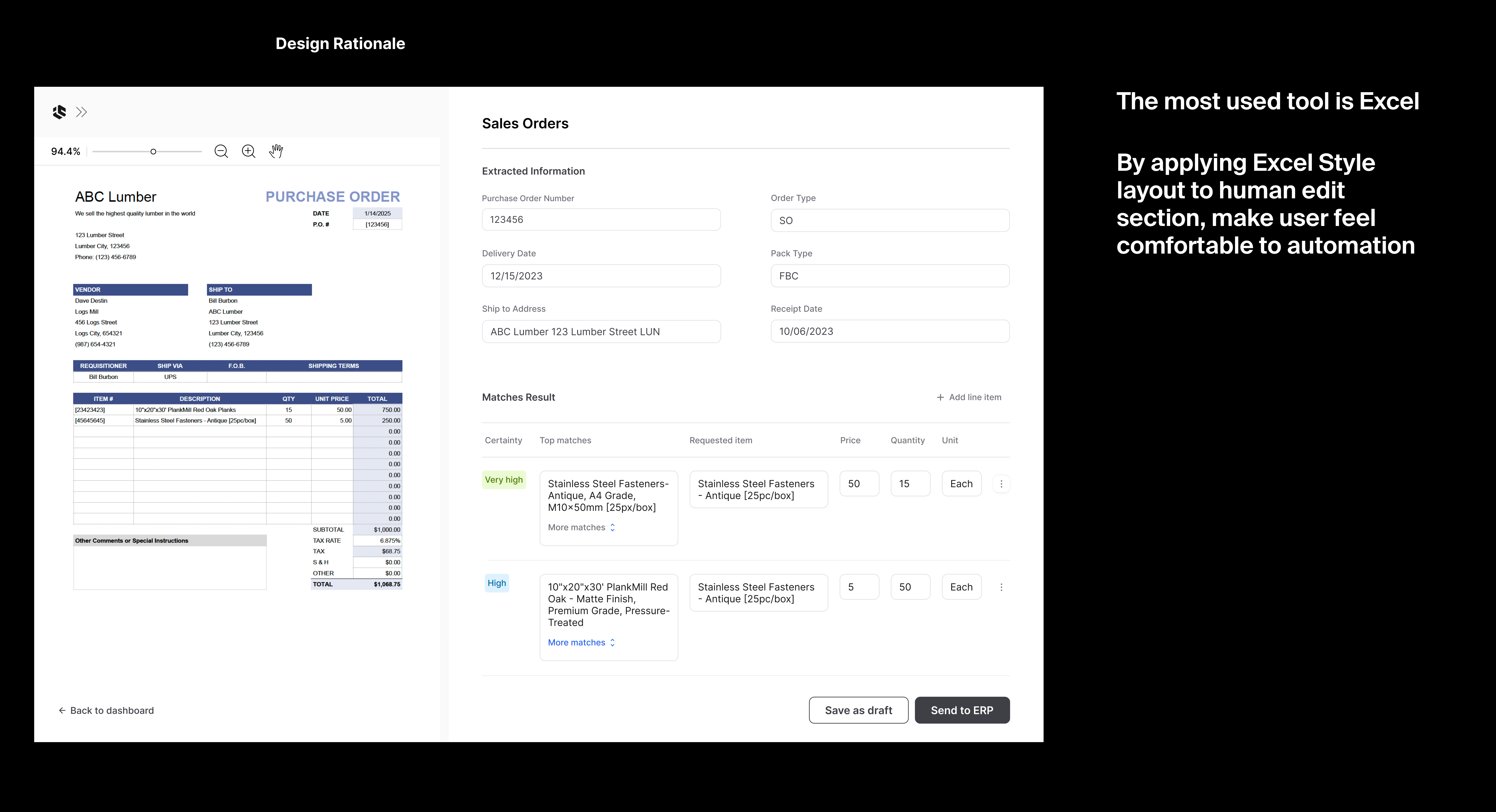
Enabled users to easily search for the information and data they needed to complete their tasks using Endeavor’s data.

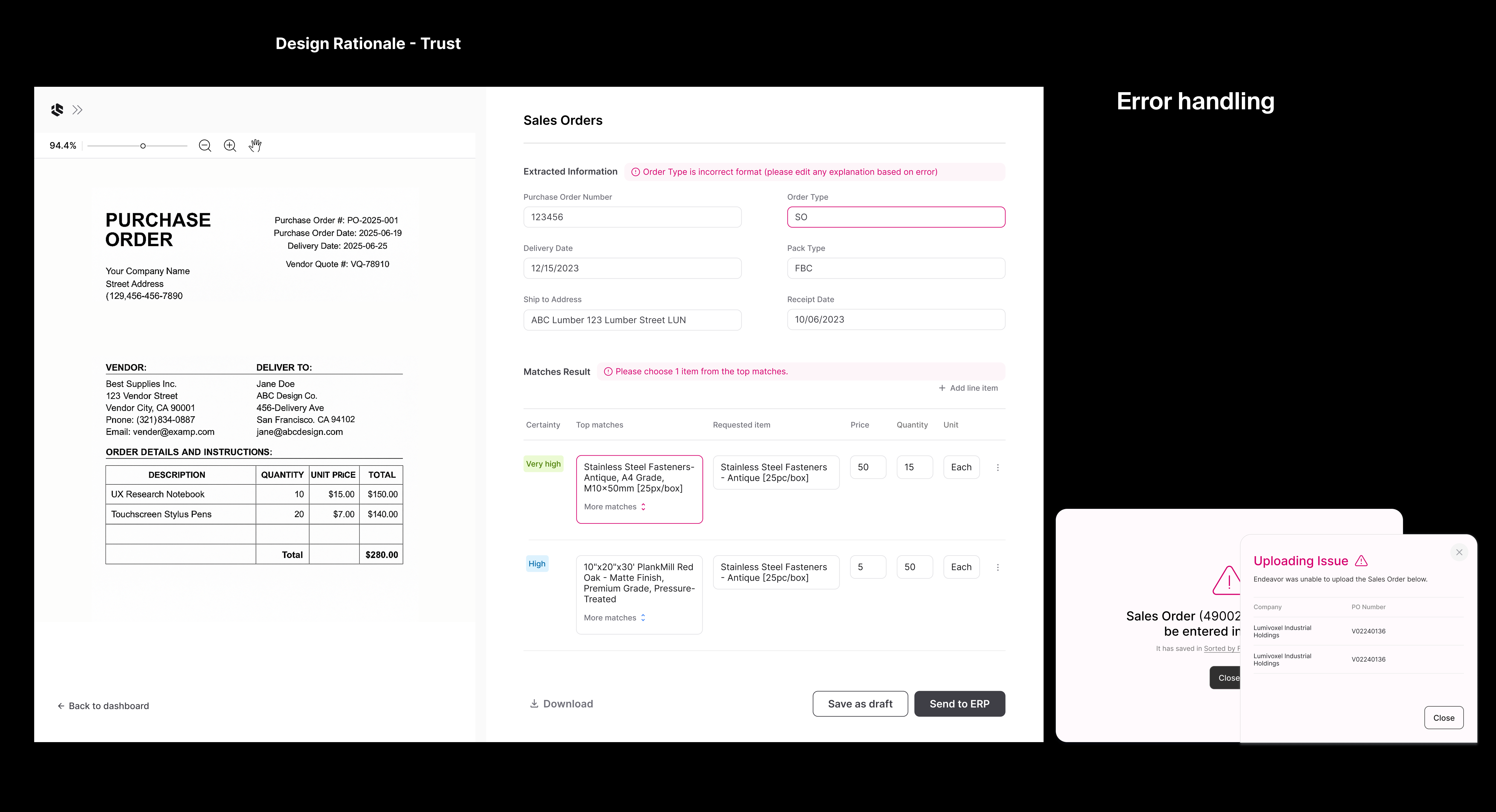
Used in forms to help users modify extracted information from Endeavor. Input fields are typically found within forms, but can also appear in modals, search interfaces, or within requested items in the Matched Results section.

Used to provide specific information that helps users take clear action and understand the next steps. These are commonly found in buttons, icons, and error notifications.

Set of components.